
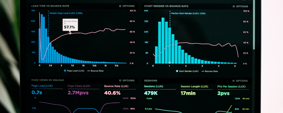
Our objective was to consolidate the data in a single god-like view so that the stakeholders can take faster and more informed decisions. We will show you exactly how we built this dashboard and what impact it carried on to the brand.
Your website has a purpose. For example, providing information to visitors, selling a product or a service, building an online/offline community, or generating leads that you can pass through your funnel to turn them into paying customers.Â
Now: Is your website serving your purpose?Â
This is where web analytics comes in. As the celebrated economist Peter Drucker said, what you cannot measure, you cannot improve. You need to know how your site is performing now, and how that compares with the past period, past year, past month, etc.
When properly set up, web analytics platforms can measure website activity and user behavior on the site and provide a great deal of insight. For example, you can learn how many users you have, how long they stayed, how many pages they visited, which pages they visited, through which link they arrived on the site, and much more.
Why Do We Need to Create a Report in the First Place?
Our client, a global e-commerce company, is an international company. It ships its products to all countries. As such, it is important for stakeholders to understand the company’s performance in different countries.Â

Rather than have to go to each Google Ads, Facebook Ads, and spreadsheet to do manual calculations, data studio gives them real-time data about the number of orders, the marketing cost, the conversion rate, cost per action, return on ad spend, and average order value.
What’s more, data studio lets them know if the particular metric has increased or decreased from the last period and by what percentage. This really puts information in the stakeholders’ fingerprints, allowing them to make informed decisions.
Blending Data
Blending data was a major challenge when creating the global dashboard. Here is why we needed different data blends.
- Â We needed to create a blend between Google Ads and Facebook Ads so that we could calculate the total marketing cost.
- Â We needed a blend between Google Ads, Facebook Ads and orders (from a Google Sheets document) to calculate the cost per action (CPA).
- We needed a blend between the number of orders (from a Google Sheets document) and the sessions from Google Ads to calculate the conversion rate.
- We needed a blend between Google Ads, Facebook Ads, and the revenue (from Google Sheets spreadsheet) to calculate the return on ad spend (ROAS).
We have different markets such as BeNeLux (Belgium, The Netherland, and Luxembourg), France, Spain, Germany/Austria, the USA, the UK, Norway and the rest of the world.
Now…
Blending would have been straightforward if the client had a single Facebook Ads account and a single Google Ads account. As it turns out, there are different accounts for different markets. This means that we had to create a blend for every metric, for every market.
 Â
Â
Data Studio uses a left outer join when blending data. This means that it returns all the rows from the left table that meet the criteria, and any other rows from the right table that match. In other words, this means that if the right table has data but the left table is null, data studio will show null on the chart.
Here’s the deal:Â
To get around the blending problem, we had to check which data was most likely not to return null. For example, our client was more likely to run Facebook Ads than Google Ads for all markets except for Norway, where they mainly ran Google Ads.Â
So we made sure that the Facebook Ads data source was to the left of the blend while the Google Ads data source was to the right. For Norway, we placed the Google Ads to the left and Facebook Ads to the right.
Currency Conversion
The client’s Google Ads account used the Norwegian Krone as the default currency. However, the Facebook Ads account did not have the Norwegian Krone. This means that adding the Facebook Ads and Google Ads as is to get the total marketing cost would be wrong unless we did currency conversion.
Check this out:Â
Google Data Studio does not have a currency conversion mechanism. In Google Sheets, we have the GOOGLEFINANCE function that conveniently fetches the latest exchange rates and makes sure that the currency conversions on your sheet are updated.
In Data Studio, we had to make an assumption that we would use the current exchange rate and assume that it will not change by much in the foreseeable future. So, we created calculated fields as follows:
- Â NOK to EUR – To convert the Norwegian Krone into the Euro to use with European markets such as Belgium, Netherlands, Luxembourg, France, Spain, and Germany/Austria. Since each country has its own Google Ads account, we created a calculated field for each.
- NOK to GBP – To convert the Norwegian Krone into the British Pound to use with the UK market.
- NOK to USD – To convert the Norwegian Krone into the US dollar to use with the American market.

Converting “No Data†to “0â€
When there is no data for a particular metric in Data Studio, it returns NULL. That means that if you are adding Google Ads and Facebook Ads, and Facebook Ads is NULL, then what will the result of adding a number and NULL be? It will simply be NULL. To get around this, we need to convert the NULL values to zero so that the calculations work
Here is how we did this:
For each metric that we were to use in a blend, we created another metric that checked if the data from the metric for a certain period contained data or was NULL. If NULL, the metric returned zero and otherwise returns the metric.
So let’s say we want to blend Google Ads and Facebook Ads to get the total marketing cost. We need to go to the Google Ads data source and create a calculated metric. Then in the formula for the calculated field, we would use the following:
CASE WHEN Cost IS NULL THEN 0 ELSE Cost END
The above is a formula provided to us by default in data studio. What it does is check if the field/metric is NULL and returns zero if so. Otherwise, it returns the metric, which in our case is the “Cost.â€
 Â
Â
Now in the blend, these are the metrics we would use instead of the default ones provided by the connectors. We conveniently prefixed the calculated fields that followed this approach with “Zero – <Field Name>†so that it was clear what they did. So, for Google Ads, we used “Zero – Cost†for the Cost metric. For the Amount Spent on Facebook Ads, we used “zero – Amount Spentâ€.Â
And that’s not all…
In data studio, we have another method of converting NULL values to zero. What you do is just bring in your regular metrics into the blend. For example, in the blend to calculate the total marketing cost, bring in the “Cost†for Google Ads and “Amount Spent†for Facebook Ads.
Now, you can create a new metric on the chart itself by selecting the blended data as the data source and then going to the metric and clicking on “New Fieldâ€. Give your field a name, such as “Total Marketing Costâ€. In the formula section, enter the following formula:
NARY_MAX(Cost, 0) + NARY_MAX(Amount Spent, 0)
This will return the total marketing spend even without having to use the CASE statement provided earlier. NARY_MAX returns the maximum of the arguments provided to it.Â

You can have any number of arguments. So, if the ad spend is more than zero, it returns the ad spend. Otherwise, if the ad spend is NULL, it returns zero because is greater than NULL.
Whichever method you choose works, so choose the one that is most convenient.
Speed
With all the data sources we had added to the dashboard and all the blended data, the dashboard became considerably slow. You could wait for as long as two minutes for data to show on all charts.
This is no surprise because data studio had to parse through tons of data, do the conversions (if any), do the calculation (if any) and populate the charts with the data. So if you change the date range on the date picker, you’d need to find something to do with the two minutes of your life that you’d have to wait for the dashboard to load all the data.
Now:
We did research and found that data studio has a data connector called “Extract Dataâ€. What this does is it takes your data source, and you specify the number of days from today you’d like data extracted. Then you can specify how often you want the data to be auto-extracted.
This was a game-changer because we set the Extract Data to extract data for only the last 28 days and to auto-update the data every morning at 8.00 AM. Our client was mainly concerned with today’s performance. So, extracting for only the past 28 days helped us discard most of the data that would anyway not be used by the client.

We used the Extract Data feature on all the data sources and then used the extracted data sources in all the blends.
The result?
The dashboard loaded almost instantaneously. Just choose any random date or range of dates that is between today and the past 28 days, excluding today. You would get the data instantly. Why did I say “excluding today�
Well, the Extract Data feature does not update data in real-time as the conventional connectors do. Remember, we set it to auto-update every day at 8.00 AM. And this makes sense, because imagine if the data was extracted in real-time. Then we would return to the slow load times, which is what we were trying to avoid in the first place.
Order Data in Sheet (Zapier/Integromat)
The data about the orders were from the Google Sheets document, which we connected to data studio using the Google Sheets connector. We used Zapier to detect when an order was made and then Zapier would send data about the order (such as order ID, order amount, shipping country, etc.) to the Google Sheets document.Â
Over time, we realized that Zapier was not sending the data as we wanted it to. So we switched to Integromat. Since the sheet contains data from all countries, we use filters in data studio to only include data from the specific country.Â
For example, For Spain, we used a filter that only included countries in the following set: {Spain, Espana},
 Conclusion
 Conclusion
It is very important that you set up web analytics properly so that you can learn how your site is performing. In this article, we looked at the global e-commerce dashboard that we helped create to help the client understand how the business is doing globally through a Google Data Studio dashboard.
At Geeks of Digital, we have hands-on knowledge on how to turn your web analytics data into insights that can be the difference between a successful business and one that fails to meet its purpose and ultimately dies. Please get in touch with us to see how we can help.
0 comments